6 Tips on How to Make The Perfect Presentation
If you are about to give a presentation and feeling nervous about it, know that it’s completely normal to feel this way. There are many things that can help ease out your nerves as well. Though the best way to feel confident about it is to prepare a great presentation in the first place.
Knowing you have something extraordinary to present in front of your audience gives you the necessary boost of confidence. Making a stellar presentation isn’t that hard either if you have your basics right.
We’ve come up with six easy-to-follow tips to help you create the perfect presentation from scratch. Let’s get started.
The key to creating a great presentation is in the content. The better and more well-laid-out your content is, the easier it becomes to map out the presentation from start to finish. That’s not to say other aspects like designing and transitions aren’t vital to the process. Everything needs to come together seamlessly.
Let’s take a look at every key element of a presentation and learn how to ace it. Here are six tips to help you create the perfect presentation with ease:
1) Use a presentation maker
Whether you already have an outline of your presentation in your mind or haven’t a clue where to begin, using a presentation maker can get you steps ahead than you would be with the traditional ways. You don’t need any prerequisites to make online presentations, everything can be sorted out as you go along.
Choose from various templates to see which one suits the tone of your content. Play around with text and design styles to craft a narrative that tells your story. Edit on the go, and most importantly, have all your data in the same place to work around as much as you need. Focus on what matters the most: crafting a compelling story.
A presentation maker helps you create great, professional-looking presentations relatively quickly. It’s because it takes care of the technicalities and lets you focus on the creative aspect of your presentation. You don’t need to know a lot about editing to edit a template either. You can make precise updates very quickly with easy-to-understand editing options.
2) Plan out the structure
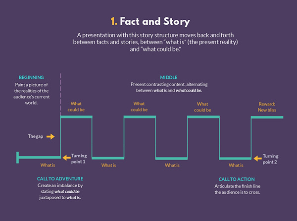
Collate and chunk the content and then go through it carefully. Now, draft it all out in an easy-to-follow structure. You may want to break it up in the classic three-act structure — a beginning, a middle, and an end. This helps you categorize the information in a cohesive way.
Your presentation needs to be short and crisp. So, limit the information to around 10 slides. Discard meandering or unnecessary information to keep it to the point.
Think of it this way: you only need to put in as much information as needed to convey the point in absolute terms, not explain it. You will be explaining the point anyway when you give the presentation. So, having it written down will only be redundant.
Here is what your structure should look like:
A) Introduction
Begin with introducing yourself and the topic. Let your audience know what your presentation entails and why it is relevant/being talked about.
A good introduction achieves three objectives in general: grasp the audience’s attention; establish the topic’s relevance; and give an overview of what will be talked about.
It’s up to you what you want the tone of the presentation to be. Though it usually depends on the topic, something that is neither too formal nor too informal works fine for most presentations. A semi-formal tone sets a great balance for most topics.
B) Body
This is the main part of your presentation. This is where you explain your topic in detail, present arguments, facts, and data in support of it. It is vital to structure and organize this part well because it is easy to get lost in your own content if you don’t have a good grasp of it. The audience should be able to follow what you are saying at all times.
You can follow the classic ‘problem and solution’ approach if you wish. In this approach, you present a problem at first, making the audience ponder over a solution. Then when you present the solution to it, you have your audience’s innate interest with you.
As mentioned above, break the content up as much as you can, condense the information to its absolute main point and rely on visual methods such as images and graphs over text. It helps shake things up and retains the audience’s attention.
C) Conclusion
As much as we emphasized on the body of the presentation, it is mostly the introduction and the conclusion to a presentation that an audience remembers the most. A presentation’s ending should leave a lasting impression on the audience.
Summarize the entire presentation in brief. Focus on key takeaways i.e., the point of the presentation. Lastly, if you can, loop back to your opening thesis to wrap everything up with a bow, so to speak. It helps give your audience a closure of sorts.
Try to end your presentation with a call to action. Let your audience know what to do next with the newly acquired information. Avoid ending with questions or on a confusing note.
3) Use text carefully
There are a lot of rules and practices dictating what the text of a presentation should look like. Some say no more than six words in a line, some say no more than five words. It’s about what works for you. If a line cannot be contained to five words, have it more than five words by all means.
The idea is to keep the written copy as limited as it can be. That means whatever does make the cut should be extremely important and should add immense value to the content. So, choose your words wisely. Doing so also helps your audience retain information better as it’s broken down into easily understandable chunks.
A presentation only lasts about 10 slides, so that also factors into the total number of words you can ultimately have in your entire presentation.
4) Make the design enhance the text
Design is one of those elements of a presentation that will only be talked about if it is actively bad. A good design structure is one that blends seamlessly with the content and tone of the presentation. It works to enhance and highlight the text in the best possible way.
Whatever design style you choose, be consistent with it. Use 1-2 muted colors as your palette. Choose a font style and size and stick with it. You can always bold, italicize, and underline it for emphasis, but don’t change the size or style.
Pay attention to the background as well. Many people make the mistake of using loud images as background to make the presentation vibrant. Text on images is often illegible.
Using colors that complement the text is a much better way to go about it. You can always experiment around to see what works best.
When you do use images, don’t make the mistake of using tiny, pixelated ones. Use large, high-quality pictures that work well with the text.
5) Visualize the data
Presenting data can be quite a tricky task. Data is already condensed, focussed information, and presenting it in simple text format may make it hard for the audience to take it all in. The best way to present data is to do so in a visual format.
Flow charts, line graphs, pie charts, you name them. Graphs and charts give you an option to have fun with data. Pick contrasting, vibrant colors to make the right kind of information stand out. Accompany minimal text to not make it look crowded.
Visualization is also helpful in making comparisons. Simply saying A is better than B is far less impactful than showing how you concluded the same.
When presenting tables, make them look as simplified as possible. Tables tend to look crowded and crammed with too much information. Doing simple things like removing borders and outlines can go a long way in making them look cleaner and condensed.
6) Present it with confidence
Once you are done with making your perfect presentation, the last step that remains is presenting it, of course. As we mentioned in the beginning, if you know you have prepared a stellar presentation, it takes much of the nervousness away regarding its presentation.
A well-structured, comprehensive yet compact presentation is much easier to present because you know how it flows. It is easier to connect your audience with it as well.
In that light, structure the content with the ease of presentation in mind. Make it so that your presentation flows. Stress on the takeaways and allow your audience to take the information with pauses as and when needed.
Conclusion
Now that you have a thorough idea about making incredible presentations, it is time to put your skills to action.
To sum it up, choose the correct template, structure the content, pay attention to the text and design, visualize information as much as possible, and present it with confidence. You are good to go!
Let us know in the comments section below what tips you find useful in creating and giving presentations.


