9 Best AI Data Visualization Tools
Ever thought what can happen if you could unlock the secrets hidden within your data with just a few clicks? Wouldn’t it be fantastic if you could transform complex data sets into clear, interactive visualizations? Welcome to the world of AI Data Visualization Tools. These powerful tools leverage artificial intelligence to simplify data analysis and presentation, making it easier than ever to extract valuable insights from your data.
In the era of big data, businesses are inundated with information. The challenge is not just collecting data but making sense of it. That’s where AI Data Visualization Tools come in. They help you understand patterns, trends, and correlations in your data, enabling you to make data-driven decisions with confidence.
The Importance of AI Data Visualization Tools
AI Data Visualization Tools are software applications that use artificial intelligence to transform raw data into visual representations. These tools can handle vast amounts of data, identifying patterns and trends that would be impossible for a human to spot. They can create a variety of visualizations, including charts, graphs, and maps, making the data more accessible and easier to understand.
These tools are not just about creating pretty pictures. They use AI algorithms to analyze the data, identify significant patterns, and even predict future trends. This allows businesses to gain deeper insights into their data, make more informed decisions, and ultimately drive better business outcomes.

Best AI Data Visualization Tools
How to choose the Best AI Data Visualization Tools?
Choosing the best AI Data Visualization Tools depends on several factors:
Ease of Use: The tool should be user-friendly, with an intuitive interface that makes it easy to create and customize visualizations.
Data Handling Capabilities: The tool should be able to handle large volumes of data from various sources.
Visualization Options: The tool should offer a wide range of visualization options to suit different types of data and analysis.
AI Capabilities: The tool should have robust AI capabilities, including machine learning algorithms for data analysis and prediction.
Integration: The tool should integrate seamlessly with other business systems, such as CRM or ERP systems.
Security: The tool should have strong security measures in place to protect your data.
Best AI Data Visualization (Free and Paid)
1. Zoho Analytics
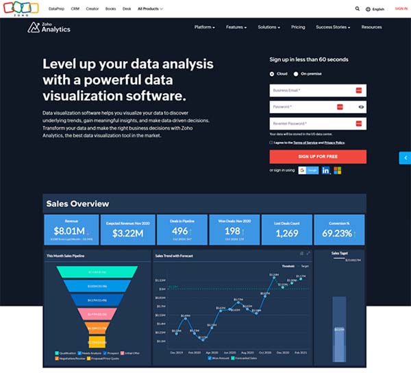
Zoho Analytics is a powerful AI data visualization tool, self-service business intelligence and data analytics software that empowers users to analyze their data, create stunning visualizations, and uncover hidden insights. This AI tool is designed to facilitate data-informed decision-making by providing a platform for creating and sharing insightful reports and dashboards. Zoho Analytics is available in both online and on-premises versions, offering flexibility to businesses based on their specific needs.
Zoho Analytics is equipped with a wide range of reporting options, including charts, pivot tables, summary views, and tabular views. It also features an intuitive drag-and-drop interface, making it easy for users to create reports. The software also includes a feature called Zia, an intelligent analytical assistant that can provide answers to queries in the form of reports and key performance indicator widgets.
Zoho Analytics Key Features
- Connects to multiple data sources for comprehensive reporting and analysis.
- Offers pre-built analytical functions for deep analysis and key metrics derivation.
- Provides unified business insights by amalgamating data from different teams.
- Features data storytelling through its scalable and powerful analytics portal.
- Includes Zia, a smart analytical assistant for quick and relevant answers.
- Allows creation of visually rich and interactive dashboards for quick insights.
- Supports a wide variety of reporting options for easy data analysis.
- Offers a purpose-built, immersive mobile app for on-the-go access and exploration.
- Ensures data security and governance with strong Zoho Security Practices.
- Provides extensibility and elasticity through robust APIs for custom analytical applications.
Zoho Analytics Pros and Cons
Pros:
- Allows users to pull quantitative information from qualitative data.
- Provides visualization of data for a good understanding of program goals.
- Enables quick creation and sharing of reports without IT assistance.
- Offers a wide range of analytics and reporting capabilities.
- Includes a data preparation tool for cleaning and analyzing data on a single platform.
Cons:
- The tool may require a learning curve for users unfamiliar with data analytics software.
- Depending on the size of the data, processing and analysis may take time.
- The cost may be a concern for small businesses or startups with a tight budget.
- Some users may prefer a non-subscription-based pricing model.
Zoho Analytics Pricing Plans
Zoho Analytics offers 4 distinct pricing plans:
Basic Plan – The Basic plan is available for $24 per month ($22 per month if billed annually). It includes support for 2 users, 0.5 million rows, and unlimited workspaces. The plan also offers features like unlimited reports and dashboards, over 100 data connectors, and daily synchronization.
Standard Plan – The Standard plan costs $48 per month ($45 per month if billed annually). It supports 5 users and 1 million rows, and includes all features of the Basic plan. Additional features include hourly data synchronization, data alerts, and data snapshots.
Premium Plan – The Premium plan is available for $115 per month ($112 per month if billed annually). It supports 15 users and 5 million rows. In addition to the features of the Standard plan, it offers advanced slideshow, private links, Zia insights, advanced data preparation, and logo rebranding.
Enterprise Plan – The Enterprise plan costs $445 per month ($435 per month if billed annually). It supports 50 users and 50 million rows. It includes all features of the Premium plan, along with 5x faster reports, live chat support, and a free analytics portal.
Custom Plan – For businesses with specific needs, Zoho Analytics offers a Custom plan. The pricing and features of this plan are tailored according to the specific requirements of the business.
Zoho Analytics accepts credit cards, PayPal, and bank wire transfer for payments.
2. Tableau

Tableau is a leading AI data visualization tool that is widely used for data analysis and business intelligence. It is designed to help users create various charts, graphs, maps, dashboards, and stories for visualizing and analyzing data, thereby aiding in making informed business decisions. Tableau is recognized for its ability to handle vast volumes of data and its user-friendly interface that requires no prior programming knowledge. It is a tool that is as useful for novices as it is for experienced data analysts.
Tableau offers a range of enterprise features including on-prem deployment, governance, and data management. However, it’s worth noting that to fully utilize these features, dedicated admins for Tableau may be required. Despite its wide range of capabilities, Tableau maintains a focus on one thing – helping people see and understand data, driving businesses forward with data-driven insights.
Tableau Key Features
- Offers powerful data discovery and exploration, enabling users to answer important questions in seconds.
- Supports a wide range of data sources, including Excel files, SQL databases, Salesforce, and more.
- Provides instant access to the best analytic solutions with ready-to-use dashboards.
- Allows users to modify data with familiar tools before analyzing it in Tableau using Table Extensions.
- Features an extensive online marketplace, Tableau Exchange, with a wide range of accelerators, connectors, and dashboard extensions.
- Includes interactive functionalities like zoom and pan controls for adjusting the view of data.
- Offers AI-powered analytics with smart suggestions and in-product guidance.
- Enables secure sharing of data from various data sources in real-time.
- Supports cross-database join, nested sorting, drag-and-drop integration, and data connectors.
- Provides improved tables with up to 50 columns, horizontal scrolling, and sorting by dimensions and measures.
Tableau Pros and Cons
Pros:
- High performance: Tableau can handle millions of rows of data with ease.
- Ease of implementation: Users without relevant experience can start immediately with creating visualizations using Tableau.
- Data visualization: Tableau supports complex computations, data blending, and dashboarding for creating beautiful visualizations.
- Collaboration: Tableau provides convenient options to collaborate with other users and instantly share data in real-time.
- AI Integration: Tableau AI brings trusted generative AI to the entire Tableau Platform to democratize data analysis and simplify insights consumption at scale.
Cons:
- Some users have reported that they can’t customize visualizations the way they want.
- While Tableau is user-friendly, it can be challenging to learn all its features and capabilities.
- Tableau’s pricing can be complex and quickly add up, especially when trying to scale.
- Tableau Desktop allows for very basic preprocessing, which may require additional tools for more complex data cleansing and formatting.
- Requires dedicated admins to fully utilize Tableau’s enterprise features.
Tableau Pricing Plans
Tableau offers 3 main pricing plans:
Tableau Creator – This plan is designed for analysts and power users who ask deep questions of their data and discover insights. It includes Tableau Desktop, Tableau Prep Builder, and one Creator license of Tableau Server or Tableau Cloud. The Tableau Creator plan is available for $75 per month when billed annually.
Tableau Explorer – This plan is designed for users who need to explore trusted data and answer their own questions faster with full self-service analytics. It includes one Explorer license of Tableau Server. The Tableau Explorer plan is available for $42 per month when billed annually.
Tableau Viewer – This plan is designed for users who need to view and interact with dashboards and visualizations in a secure, easy-to-use platform. It includes one Viewer license of Tableau Server. The Tableau Viewer plan is available for $15 per month when billed annually.
3. Google Looker
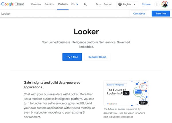
Google Looker is an AI data visualization tool designed to help businesses explore, share, and visualize their data, thereby facilitating informed decision-making. As a product of Google Cloud, Looker provides a platform that allows users to access, analyze, and act on the most current and trusted version of their data. It is more than just a business intelligence platform; it is a tool that enables the creation of insight-powered workflows and applications, delivering trusted data experiences at scale from the cloud of your choice.
Looker is designed to improve productivity, decision-making, and innovation by delivering insights to more users. It simplifies the creation of reports and dashboards, eliminating stale data and siloed approaches to business logic. With Looker, businesses can leverage prebuilt integrations or build their own using Looker’s robust APIs, providing a fresh, consistent, and governed real-time view of data across multiple clouds to the entire organization.
Google Looker Key Features
- Provides a unified business intelligence platform for self-service or governed BI.
- Enables the creation of custom applications with trusted metrics.
- Allows for the visualization of data through highly configurable charts, tables, and reports.
- Facilitates the sharing of insights with teams or the wider world.
- Offers a powerful SQL-based modeling language, LookML, for efficient data management.
- Integrates with other Google Cloud services for a seamless user experience.
- Supports the creation and editing of dashboards and reports.
- Provides proactive insights at the right time and place through alerts and deep integrations.
- Allows for the setup and administration of Looker, including database connection and system administration functions.
Google Looker Pros and Cons
Pros:
- Provides real-time insights, enabling businesses to make informed decisions quickly.
- Offers a robust API, allowing for seamless integration with other systems.
- Supports a wide range of data sources, enhancing its versatility.
- Facilitates collaboration with unified measurement, connected to your business intelligence software of choice.
- Looker’s LookML language simplifies data management and removes technical skills as a potential barrier.
Cons:
- Some users have reported that Looker lacks the ability to provide ‘and’ operators when filtering.
- It does not auto-create a data dictionary for defined dimensions.
- The platform may be complex for less technical users to navigate and use effectively.
- The pricing structure may not be transparent, making it difficult for businesses to budget effectively.
Google Looker Pricing Plans
Google Looker offers three main pricing plans:
Viewer User Plan – This plan is available for $30 per user per month. It is designed for users who primarily need to view and interact with dashboards and reports.
Standard User Plan – The Standard User plan is available for $60 per user per month. It includes all the features of the Viewer User plan, plus the ability to explore data and create and save content.
Developer User Plan – The Developer User plan is available for $125 per user per month. This plan is designed for users who need to develop and maintain Looker data models.
In addition to these user-based plans, Google Looker also offers three platform editions: Standard, Enterprise, and Embed. These editions include a variety of features such as platform administration, integrations, semantic modeling capabilities, and varying levels of API calls per month. The cost of these platform editions is not specified and may vary based on the specific needs of the organization.
Google Looker accepts payment methods including credit cards, Google Pay, and bank accounts.
4. MS Power BI
MS Power BI is a collection of software services, apps, and connectors that work together to turn unrelated sources of data into coherent, visually immersive, and interactive insights. It allows users to easily connect to their data sources, visualize and discover what’s important, and share that with anyone or everyone they want. Power BI consists of several elements that all work together, starting with Power BI Desktop, the Power BI service, and Power BI Mobile apps for Windows, iOS, and Android devices. These elements are designed to let users create, share, and consume business insights in the way that serves them and their role most effectively.
Power BI is a flexible and compelling tool, available to users in different roles. For example, you can use Power BI Desktop to create reports for your own team about customer engagement statistics and view inventory and manufacturing progress in a real-time dashboard in the Power BI service. You can create a paginated report of mailable invoices, based on a Power BI semantic model. Each part of Power BI is available to you, which is why it’s so flexible and compelling.
MS Power BI Key Features
- Offers a range of attractive visualizations including line charts, area charts, pie charts, and more.
- Allows users to connect to multiple data sources, including Excel spreadsheets, cloud services, streaming data, and on-premise databases.
- Provides the ability to shape data with queries that build insightful, compelling data models.
- Enables the creation of customizable dashboards that update in real-time.
- Facilitates report sharing and collaboration with built-in governance and security.
- Supports the creation of robust data models and amazing reports to amplify business intelligence.
- Offers frequent updates, with Microsoft releasing updates to Power BI monthly.
- Allows users to work with large datasets, with Power BI compressing data for efficient analysis.
- Provides the ability to create custom visualizations with R and Python.
- Offers a secure data analytics platform, with sensitivity labels applied to Power BI data using Microsoft Information Protection.
MS Power BI Pros and Cons
Pros:
- Power BI is inexpensive, making it accessible for many users and organizations.
- It offers frequent updates, with Microsoft releasing updates to Power BI monthly.
- Power BI allows users to work with large datasets, with the tool compressing data for efficient analysis.
- It provides the ability to create custom visualizations with R and Python, offering flexibility for users.
- Power BI offers a secure data analytics platform, with sensitivity labels applied to Power BI data using Microsoft Information Protection.
Cons:
- Power BI has a limit on the amount of data it can ingest, which can be a limitation for users working with very large datasets.
- Ingesting millions of rows of data can take a long time, which can be frustrating for users.
- The free version of Power BI will sample data when exporting it in large amounts, which may not be ideal for some users.
MS Power BI Pricing Plans
Microsoft Power BI offers two main pricing plans: Power BI Free and Power BI Pro.
Power BI Free Plan: This plan is available at no cost and allows users to create rich, interactive reports using Power BI. It does not require a credit card and is a good starting point for individuals who want to explore the capabilities of Power BI.
Power BI Pro: Priced at $10 per user per month, this plan is designed for individual users who need modern, self-service analytics for publishing reports and dashboards, and viewing content across their organization. It includes the ability to publish and share Power BI reports. Power BI Pro is also included in Microsoft 365 and can be purchased with a credit card.
Microsoft Power BI accepts credit cards for the plans payments.
5. Sisense
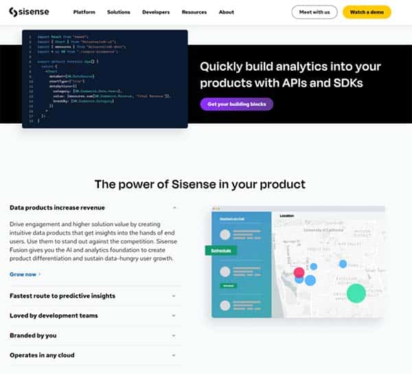
Sisense is an AI data visualization, business intelligence (BI) software and data analytics platform that help organizations to gather, analyze, and visualize data from a variety of sources. It is designed to simplify complex data and transform it into powerful analytic applications, which can be shared or embedded anywhere. Sisense is built to help businesses make informed decisions by providing a user-friendly interface for data exploration and reporting. It is a comprehensive tool that allows users to analyze and visualize large, disparate data sets without the need for IT resources.
Sisense is designed to make it easy to mashup data from across the entire data landscape and transform it into actionable analytics applications that can be embedded anywhere. The platform is used by innovative startups and global brands alike to accelerate innovation and drive digital transformation by embedding Sisense into their businesses. Whether data is in the cloud, on-prem, or a mix of both, Sisense provides everything needed to successfully deliver on an analytics application strategy.
Sisense Key Features
- Offers a range of visualization options, including charts, graphs, and interactive dashboards.
- Enables users to connect to a wide range of data sources, including databases, spreadsheets, cloud services, and web applications.
- Incorporates AI and machine learning capabilities for predictive analytics and data forecasting.
- Provides features for data security and governance, ensuring that sensitive data is protected and compliant with relevant regulations.
- Designed to scale with the needs of the business, handling large data sets and multiple users with ease.
- Allows businesses to embed AI-powered analytics with pro-code, low-code, and no-code capabilities directly into their products or services.
- Offers a user-friendly interface that simplifies data exploration and reporting.
- Provides a high-performance platform with a solid backend architecture.
Sisense Pros and Cons
Pros:
- High performance with large amounts of data and multiple tables.
- Scalability for thousands of users.
- Simple to create and publish advanced data visualizations.
- User-friendly interface, minimal learning curve even for non-technical users.
- Robust features for data modeling and complex calculations.
- Offers built-in connectors and smooth integration with popular third-party applications.
Cons:
- The cost of the platform may be a barrier for some businesses.
- There could be a simpler way for admins to share dashboards created by multiple users.
- Some users have reported a steep learning curve for advanced features.
- The platform may not be broadly integrated with certain software.
Sisense Pricing Plans
Sisense offers a customized pricing plan that is tailored to meet the specific needs of your business. You need to contact Sisense sales team to get a custom pricing plan.
6. DOMO
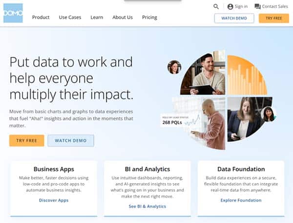
DOMO is a cloud-based AI data visualization and business intelligence platform that offers an advanced solution for data management, analysis, and visualization. It empowers organizations to collect data from various sources, transform and cleanse the data, and present it in the form of interactive dashboards, reports, and charts. With its user-friendly interface and powerful features, DOMO enables businesses to make data-driven decisions and communicate insights effectively.
DOMO Key Features
- Offers over 150 chart types for creating live visualizations.
- Provides a suite of AI tools for chat-style data exploration and model management.
- Enables fast query handling even with simultaneous queries on billions of rows.
- Allows creation of low-code and pro-code apps to improve business processes.
- Supports data integration with a library of 1,000+ connectors.
- Facilitates data transformation with a simple drag-and-drop interface.
- Offers a responsive user experience from any device.
- Provides role-based access controls for data governance.
- Allows creation of custom visualizations using HTML, CSS, JavaScript, and more.
DOMO Pros and Cons
Pros:
- Offers a comprehensive solution for data management, analysis, and visualization.
- Provides a user-friendly interface that makes it easy to create visualizations and dashboards.
- Enables real-time data analysis and reporting, facilitating data-driven decision making.
- Offers robust data integration capabilities with a wide range of connectors.
- Provides strong data governance features, including role-based access controls.
Cons:
- Some users have reported that the tool can be expensive for businesses that want to bring in a lot of data.
- The error messages displayed by the tool could provide more information to help users troubleshoot issues.
- While the tool is user-friendly, there may be a learning curve for users who are not familiar with data visualization and business intelligence tools.
DOMO Pricing Plans
DOMO offers 4 pricing plans:
Free Forever Plan – This plan is available at no cost and includes a fully featured product with an unlimited number of users. There is no time limit and no credit card is needed to access this plan.
Standard Plan – The standard plan starts at $300 per month. It includes all the features of the Free Forever plan, with additional capabilities for scaling and control.
Enterprise Plan – The pricing for the Enterprise plan is available upon request from the sales team. This plan is designed for larger businesses and includes all the features of the Standard plan, with additional tools for data scientists and embedded analytics solutions.
Business Critical Plan – The pricing for the Business-Critical plan is also available upon request from the sales team. This plan includes all the features of the Enterprise plan, with additional capabilities for creating tailored business apps and automating business processes.
All plans include access to a suite of data connection tools, ETL tools, visualization tools, and AI and data science tools.
DOMO accepts credit cards and bank wire transfer.
7. Qlik
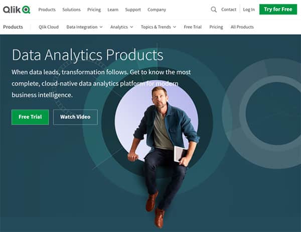
Qlik is a powerful AI data visualization tool that stands out for its unique Associative Engine and AI capabilities. This tool is designed to transform complex data into clear, compelling stories and actionable insights, increasing efficiency and profits for businesses. Qlik’s platform, Qlik Cloud, delivers real-time, up-to-date information designed to trigger immediate actions when they matter most. It brings data and analytics together seamlessly with an end-to-end, real-time analytics data pipeline.
Qlik is not just about transforming data into graphical formats. It’s an essential capability within an organization’s business intelligence (BI) strategy. When you choose the right visualization to highlight the most important aspects of your data, you can illuminate new insights and communicate them more persuasively. This can result in smarter actions and bigger outcomes for your business.
Qlik Key Features
- Qlik’s Associative Engine indexes and connects relationships between data points for creating actionable insights.
- Offers advanced analytics and AutoML for automated insights and natural language interaction.
- Features over 20 automated analysis types such as rankings, trendings, comparisons, clustering, correlations, forecasts and more.
- Provides a unique and powerful data storytelling capability, offering intelligent and in-context commentary for the data analytics visuals.
- Allows users to freely explore data in whatever direction their intuition leads them.
- Qlik Sense enhances nearly everything you do with AI, including auto-generating advanced analytics and insights.
- Offers a convenient, centralized hub for collaboration and sharing of information, including data, reports, and applications.
- Compatible with a wide range of devices, from desktop and laptop computers to tablets and smartphones.
Qlik Pros and Cons
Pros:
- Qlik’s Associative Engine allows for fast analysis and association of large volumes of data.
- The platform is robust, secure, simple to use and configure.
- Offers on-demand app generation and mashups.
- Qlik Sense is designed to improve data literacy for all users, regardless of their previous skill sets and analytics backgrounds.
- Provides users access to a convenient, centralized hub that makes it easy for them to collaborate and share information.
Cons:
- As an in-memory tool, Qlik tends to slow down as data volume increases, requiring a machine with higher configuration to support data volume.
- Some users feel that Qlik Sense needs some technical knowledge to understand it completely.
- It is best suited for simple analytics, but it is hard to set up custom stuff, what-if scenarios, and advanced statistical analysis.
Qlik Pricing Plans
Qlik offers three pricing plans for their Cloud Analytics service:
Standard Plan: This plan is designed for small teams or users who need basic features. The pricing and specific inclusions for this plan are not publicly available.
Premium Plan: The Premium plan starts at $2,700 per month for 50 GB of data per year. It includes all the features of the Standard plan, plus unlimited experiments, 2 deployed models, 5,000 automation runs per month, and automated report compilation and distribution.
Enterprise Plan: The Enterprise plan is tailored for larger organizations and offers custom pricing. It includes all the features of the Premium plan, with additional benefits and scalability options.
Qlik accepts credit cards, PayPal and bank wire transfers.
8. Polymer
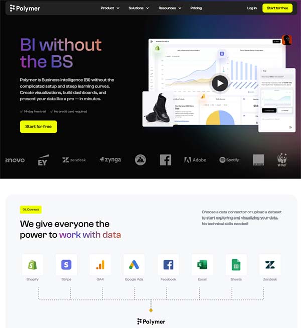
Polymer is an AI-powered data visualization tool that simplifies the process of Business Intelligence. It is designed to eliminate the complexities and steep learning curves often associated with data analysis and presentation. With Polymer, users can effortlessly build dashboards, visualize, and present their data like professionals, making it an invaluable tool for businesses and individuals alike.
The AI tool is lauded for its insight automation feature, which allows users to quickly identify key performance indicators and make data-driven decisions. Polymer is designed to be user-friendly, making data analysis and visualization accessible to all, regardless of their technical skills.
Polymer Key Features
- Provides Business Intelligence without the complicated setup and steep learning curves.
- Allows users to build dashboards, visualize, and present data professionally.
- Features insight automation for quick identification of top-performing demographics.
- Enables users to create a searchable archive of data.
- Offers a no-code tool, making it accessible to everyone in the team.
- Provides an affordable data visualization solution at only $9 per month.
- Allows for easy import of data from various sources like Google Sheets, Excel, Facebook Ads, Google Ads, and more.
- Uses AI to recommend different visualizations and build insightful dashboards with ease.
- Keeps teams or clients updated in real-time with valuable insights.
Polymer Pros and Cons
Pros:
- User-friendly interface that makes data visualization accessible to everyone.
- Affordable pricing model, making it a cost-effective solution for businesses of all sizes.
- The insight automation feature allows for quick identification of key performance indicators.
- No-code tool, making it easy for non-technical users to create dashboards and visualize data.
- Real-time updates keep teams or clients informed with valuable insights.
Cons:
- Some users may find the tool less robust compared to other data visualization tools in the market.
- The AI tool may not be suitable for complex data analysis that requires advanced technical skills.
- The affordability of the tool may lead to questions about its quality and reliability.
Polymer Pricing Plans
Polymer offers three pricing plans: Starter, Pro, and Enterprise.
Starter Plan – The starter plan is designed for individuals just getting started with Polymer. It costs $20 per editor per month if billed monthly, or $10 per editor per month if billed annually. The plan includes manual syncing, unlimited connectors, unlimited visualizations, and unlimited templates.
Pro Plan – The pro plan is for those who want to explore, visualize, and share their data. It costs $40 per editor per month if billed monthly, or $20 per editor per month if billed annually. The plan includes everything from the starter plan, plus hourly syncing, custom branding, custom metrics & calculations, and unlimited embeds.
Enterprise Plan – The enterprise plan is for companies and teams with custom data needs. The pricing starts at $500 per month. The plan includes everything from the pro plan, plus real-time syncing, customizable embeds, API access, and dedicated support.
Polymer relies on Stripe for payment processing and accepts all major credit cards.
9. Visual.ly
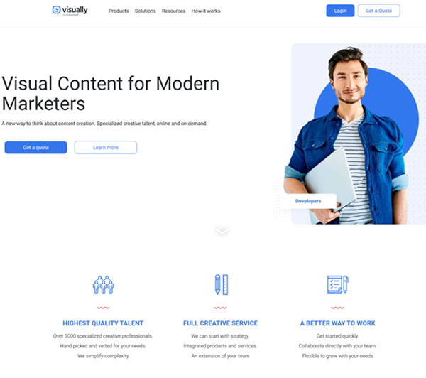
Visual.ly is a dynamic AI platform that specializes in data visualization and infographics. It serves as a hub for data visualizers to share their work and connect with those who want to commercialize them. The platform is designed to transform the creation of data-based graphics from a tedious manual process into something fast and flexible. It offers a wide range of visualizations to explore across various categories, from sports and technology to the economy.
Visual.ly provides tools to create completely new visualizations. It aims to bridge the gap between infographics and visualization, providing a middle ground that combines design tools with visualization. The platform is also working on tools for finding data and visualization templates, making it a comprehensive solution for data visualization needs.
Visual.ly Key Features
- Provides a platform for data visualizers to share their work.
- Offers tools to create new visualizations.
- Features a wide range of visualizations across various categories.
- Aims to streamline the process of creating data-based graphics.
- Provides tools for finding data and visualization templates.
- Connects creators with potential publishers for their infographics.
- Offers a social hub for fans of big data.
- Works on making the presentation of data fast and flexible.
Visual.ly Pros and Cons
Pros:
- Provides a platform for sharing and creating infographics.
- Offers a wide range of visualizations across various categories.
- Streamlines the process of creating data-based graphics.
- Connects creators with potential publishers.
Cons:
- The platform may be complex for beginners.
- Some design restrictions may apply.
- The cost of creating custom infographics may be high for some users.
- The platform may not be practical for small-scale projects.
Visual.ly Pricing Plan
Visual.ly offers custom pricing plans according to the user’s preferences. You need to contact Visual.ly sales team to get a pricing quote.
FAQs on AI Data Visualization Tools
What is an AI Data Visualization Tool?
An AI Data Visualization Tool is a software application that uses artificial intelligence to transform raw data into visual representations. These tools analyze data, identify patterns and trends, and create visualizations that make the data easier to understand.
How do AI Data Visualization Tools work?
AI Data Visualization Tools work by using AI algorithms to analyze data, identify significant patterns, and create visualizations. They can handle large volumes of data from various sources and create a variety of visualizations, including charts, graphs, and maps.
Who can benefit from using AI Data Visualization Tools?
Businesses of all sizes and across all industries can benefit from using AI Data Visualization Tools. They are particularly useful for businesses that deal with large volumes of data and need to make sense of it quickly and accurately.
What are the different types of AI Data Visualization Tools?
There are many different types of AI Data Visualization Tools, including tools for business intelligence, data analysis, predictive analytics, and more. Some tools are general-purpose, while others are designed for specific industries or types of data.
Are there free AI Data Visualization Tools available?
Yes, there are free AI Data Visualization Tools available. However, these may have limitations in terms of features and capabilities compared to paid versions.
What are the limitations of AI Data Visualization Tools?
While AI Data Visualization Tools are powerful, they do have limitations. They require quality data to produce accurate results, and they can be complex to set up and use. Also, they can only identify patterns and trends in the data you have, not the data you don’t have.
Conclusion
AI Data Visualization Tools are revolutionizing the way businesses handle data. By leveraging artificial intelligence, these tools make it easier than ever to analyze data, identify trends, and make data-driven decisions. Whether you’re a small business owner looking to understand your customers better, or a large corporation trying to predict future trends, AI Data Visualization Tools can provide the insights you need.
However, it’s important to choose the right tool for your needs. Consider factors like ease of use, data handling capabilities, visualization options, AI capabilities, integration, and security when making your decision. With the right tool, you can unlock the full potential of your data and drive your business forward.
Share your thoughts and insights with other readers.