Discover the best data visualization tools, how to choose the one which is best fit to the organization to enhance the analytics activities and maximize the business results.
How well do you really understand the overall health of your business?
If you’re not sure how to answer that question, you’re not alone. Many businesses don’t have a clear picture of their business’s performance, although they have an unprecedented amount of information to use.
But if it’s not a lack of data, why’s there so much uncertainty?
The truth is, all that data is completely useless if you don’t have a way to turn it into something useful and easy to understand.
Enter… data visualization.
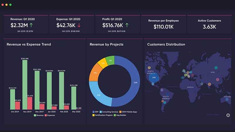
The best data visualization tools help you turn any number of data points into something that makes sense. So, rather than a bunch of numbers, you have a clear vision of what those numbers mean.
In this article, I cover my top choices for different situations, when you should invest in a data visualization tool, and the methodology I used to find the best options.
7 Best Data Visualization Tools
Here are the 7 best data visualization tools to consider for your business or company:
1) Zoho Analytics – Zoho is the best data visualization tool for beginners.
2) Tableau – Tableau is the best advanced, feature-rich data visualization software.
3) Cluvio – Cluvio is the best for growing small businesses and startups.
4) Sisense – Sisense is the best for data engineers and developers.
5) Whatagraph – Whataraph is the best data visualization tool for agencies.
6) Datawrapper – Datawrapper is the best for interactive charts and maps.
7) Infogram – Infogram is the best DIY drag-and-drop visualization builder.